Hoken is a travel marketplace to find great hotel rooms near highly demanded events.
Guest Checkout simplified the experience of booking a room with us which improved our conversion rates significantly.
As a Principal Product Designer, I took part in the data analysis that informed the direction and creation of the feature and also were in charge of re-designing the experience and new UI.

A marketplace with two personas in mind: the traveler who wants to book a room, and the trader who wants to catch rooms before demand is high.
Hoken was conceived as a marketplace designed for fans of major events—concerts, sports, festivals—who also valued great places to stay. We offered premium hotel rooms near high-demand events, banking on the idea that these reservations would appreciate over time as the event drew near. In some ways, it was like buying a digital asset—book early, and potentially resell later for a profit.
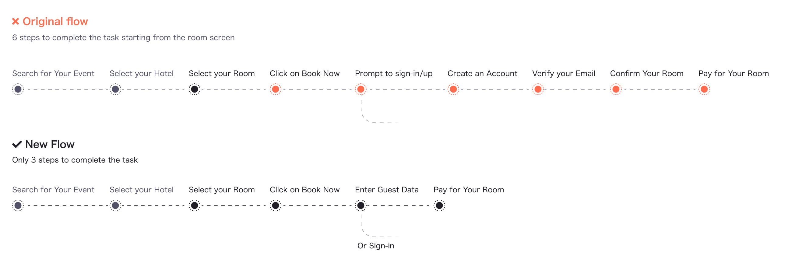
When I joined, the MVP was already live. It followed standard onboarding practices: you had to create an account, confirm your email, and only then could you book or resell a room. This flow was optimized for our “trader” persona—users who wanted to speculate on room prices. But it introduced a lot of friction for a different (and much larger) segment: travelers who just wanted to book a stay, no strings attached.
At the time, we were treating all users the same in our checkout flow—even though we knew, consciously, that we had two distinct audiences: travelers and traders. By assuming everyone was eventually going to resell, we were alienating a huge group of people who just wanted to book a room quickly and move on. That misalignment was the seed of what would become Guest Checkout.
Unifying the experience for our two personas was enticing, but it was creating friction on the users who were the backbone of the marketplace.
We were losing high-intent users at the checkout. The data from Heap showed a clear pattern: people were browsing rooms, reaching the payment flow, and then dropping off. They were curious—or even ready to buy—but they didn’t want to create an account or verify their email just to complete a booking.
At the time, we believed the friction was about trust. So we added reassurance: secure Stripe transactions, trust badges, and messaging about safety. But the drop-offs continued.
The real issue was deeper.
We were treating every user like a potential trader—someone who might resell a room later. But not everyone wanted that. Many were just travelers who needed a great place to stay. They didn’t want to “join” Hoken or become part of the marketplace—they just wanted a room. And our flow wasn’t honoring that.
By asking everyone to go through the same steps, we created friction that didn’t match their intent. We were forcing commitment where flexibility was needed.
At Hoken, growth meant sales. For us even at an early stage profitability was paramount to show the success of our product. Guest checkout wasn’t just a UX Improvement, it was a strategic unlock.

Sales weren’t moving in the right direction and friction was clearly pictured in our product data.
We knew the checkout flow inside and out. It had been tested before and seemed straightforward on paper. But the data told a different story: users were reaching the payment step and dropping off. They had purchase intent—but the flow was getting in the way.
We turned to Heap to dig deeper, and it confirmed what we suspected: too much friction, too early in the process. Creating an account, verifying an email, providing personal info—it was too much to ask for someone who just wanted to make a quick booking.
That’s when the real job became clear:
“When I find the right room, I want to book it easily and without hassle—without having to commit to anything beyond this trip.”
We didn’t run user tests or interviews for this one—we knew it was the right move. It was a bold decision, grounded in data and first-hand familiarity with the flow. We streamlined the journey, ran internal QA (dogfooding), and launched straight to production.
The results spoke for themselves. Sales went up, drop-offs went down, and we knew we were finally aligned with what users were actually trying to do.

Cut friction for travelers rearranging the checkout flow based on what you wanted to do on the platform.
At Hoken, I was closely tied to data. I reviewed Heap almost weekly, constantly looking for friction points and opportunities to improve the experience. That’s how I noticed the drop-off during checkout. I wasn’t the only one—others on the team had seen similar patterns. When I brought it up with our Head of Product, the conversation clicked into place. We all saw the same problem. It was time to fix it.
From there, I worked side by side with engineering to explore how we could reduce friction without compromising the integrity of our system. We were using Stripe for payments, and while the implementation helped us build trust, it also introduced constraints—especially around the checkout logic and how users were authenticated.
Guest Checkout meant cutting steps that were originally designed to support the resale model. So we had to be surgical. I worked with engineering to understand which checks could be removed, what could be deferred, and how to keep the transaction secure without requiring full account creation.
The result was a streamlined flow built around the traveler’s mindset—not the trader’s.
We rebuilt the checkout experience around speed, simplicity, and reassurance.
The new Guest Checkout flow cut the original six-to-eight step journey down to just two:
That was it. No account creation. No email verification. Just a direct path to booking.
After checkout, we added subtle emotional design—confetti and clear, friendly messaging like “Your room is booked. No worries.” The goal was to end the experience on a note of confidence and relief. No ambiguity. Just clarity and closure.
For those who wanted to take advantage of the resale or portfolio-tracking features, we invited them to complete their account after booking—both through in-app reminders and email nudges. But this was optional, not mandatory.
Design-wise, we simplified the tone, trimmed the visual clutter, and framed the experience to feel more personal and rewarding. This wasn't just a UX patch—it was a full shift in how we treated user intent.


Increased sales, and a change in perspective.
Guest Checkout reduced drop-offs and paved the way for higher conversion rates. Combined with other marketing initiatives, it helped drive an increase in sales—but it was clear that Guest Checkout was the backbone of that success. Without it, none of our acquisition efforts would have landed as effectively.
It also changed how we saw our users—and how we prioritized them.
Up to that point, we had been building Hoken as a marketplace, but with a very trader-centric mind, adding features like: showing pricing trends, room comparisons, and historical data to help them make smarter decisions.
Guest Checkout made something clear: the marketplace wouldn’t work without travelers. They were the ones generating demand, booking rooms, and giving traders something to speculate on in the first place. Without them, there was nothing to trade.
Thinking about your user segments in a strategic way is a must.
The shift brought by Guest Checkout pushed us to focus more intentionally on the traveler experience—not just because it was easier to optimize, but because it was essential for everything else. Travelers were also more likely to drive organic growth through word of mouth. The more people who booked a room and had a good experience, the more likely they were to tell others and help build trust in the brand.
Guest Checkout wasn’t just a conversion fix—it was a strategic realignment. It reminded us who we were really building for.