I played a key role in defining major features, leading the product design team, shaping the user experience and interface, contributing to research, and collaborating closely with leadership and engineering teams to drive growth and profitability.
This case includes an in-depth feature study of Guest Checkout ->
Hoken is an innovative startup offering hotel room bookings around high-demand events like music and sports, where accommodations are often limited, also offering the possibility of reselling rooms.
Increased sales by 2x with a user-centered approach
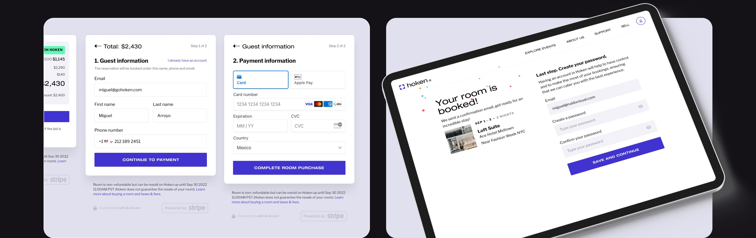
Mandatory account creation at checkout for new users disrupted their primary goal of booking a room, leading to high drop-off rates.
I conducted usability tests, interviews and collaborated with the operations team to define essential data and create a new flow for users without an account (the majority of them).
Mandatory account creation at checkout for new users disrupted their primary goal of booking a room, leading to high drop-off rates.
The Stripe integration implementation required the email before creating a payment intent. Collaborating with the engineering team we created a straightforward 2-step process, that covered business and users’ needs.


Want to go deeper? Check the in-depth breakdown of Guest Checkout ->
Event page views per user increased from 3.40 to 4.71, and engagement time rose from 34s to 1m.
Users found it difficult to locate specific events quickly either in the homepage curated events section and the all-events page, leading to a high abandonment rate.
Conducted asynchronous interviews and usability tests and confirmed the need. Designed a prominent search bar on the homepage to address this issue.
Replaced a curated event module in the hero section with a universal search, aligning the homepage with users’ primary goal.
Mobile usability was challenging; initially used a new screen, then optimized to a modal for fewer clicks.

Increased conversion by 4% and reduced bounce rate to half.
Users coming from Google Hotel Search were presented only the room they selected on Google and were very likely to keep browsing for other hotels elsewhere.
Interviewed users and discovered that Hoken was part of a larger research effort, and that other options were not easily discoverable in our platform.
We iterated on several ways to show other hotels and rooms alongside the room users previously selected. First as collapsible sections, and converging into making a list-style view.
Maintaining a clear Call-to-action while showing a lot of other optional actions and depth. On the front-end side, re-imagining the room-card component, using the same endpoints and information.


⨉ Original version
Only information about the room and the other same-type rooms

First redesign iteration
Included related rooms and hotels, keep CTA above the fold.

Second redesign iteration
Included hotel context and easier to browse related rooms and hotels. Increased conversion and reduced bounce rate. related rooms and hotels, keep CTA above the fold.
Successfully nudged all users to set realistic prices
Users needed guidance to set realistic resale prices, promoting healthy marketplace dynamics and preventing unrealistic listings.
Analysis of user’s expectations and cross-functional collaboration with Head of Product, Operations, and C-level team to define price ranges that make sense with the market.
Supporting user autonomy with gentle nudges. Real-time feedback with color-coded guidance informed users while preserving pricing freedom.
Communicated clear interactions through a coded functional prototype, streamlining the handoff to developers.

Performed better in usability testing. Not deployed.
Original table-based layout wasn’t user-friendly, especially on mobile, and didn’t align with real user needs.
Conducted card sorting to understand priority information, leading to a simplified design with streamlined content and no horizontal scrolling.
Grouped rooms into collapsible categories based on their status (e.g., active bookings, listings for sale, bid activity), and showing the relevant information specific to those room types.
Original table-based layout wasn’t user-friendly, especially on mobile, and didn’t align with real user needs.


Increased engagement and contributed to increasing the Assets Under Management.
Collaborating with an external communication consultant we re-worked the homepage to emphasize and clarify the value proposition.
On the UX front, I rearranged and streamlined the homepage sections to show more events, show the event categories, and design a social proof section to increase the users’ trust in the business.


This was the first feature I worked with the team. I presented a viable design in about 2 weeks that was consistent with all the previous work, coherent with the business needs, and that was solving the problem (allow buyers to place bids on rooms and allow sellers to review and accept them).
I’m hiding all the process here for the sake of brevity, but I will note that it was an iterative process that considered to not disrupt the previous UX as well as giving choice control to the users to wether they wanted to place a bid or buy immediately.
After reviewing our metrics and a few iterations we realized that our overall sales went down because the marketplace was still not mature enough to allow healthy bidding dynamics, and also that the fact that the rooms had an expiration date (check-in date) was not in line with the feature.
We learned and moved on. A great product development lesson.
The objective of this project was to give users more tools to help them make decisions on buying and selling rooms, showing more information about the room’s price compared to the market (OTA sites).
This followed the thesis of making Hoken a dynamic marketplace. This initiative was accompanied with a Webinar to educate people on hotel price dynamics and how they could leverage them to either get better prices or make a profit.


Our platform always operated as a curated offering of hotels, but we realized that in order to scale we needed to increase the depth and breadth of our hotel offerings, so we started the integration of a Third Party Hotel Aggregator to be able to quickly find properties around event, that matched our curation criteria.
This integration will require changes on the experience and the interface, because hotel browsing will go from around 5 hotels per event, to potentially hundreds. The user will benefit from a wider selection, but not without offering them a set of easy-to-use tools to find their hotel fast.
I was in charge of expanding the Hoken’s Design System and to collaborate (both with code and design) with the frontend team to consolidate the Design System into a component library made in Storybook.
The objective was to keep consistency with the brand, and the previous core components and design guidelines created by Jana Stýblová and to make the system flexible and able to handle new components required for the business growth.